Your brand makes you money when it shortens the distance between a click and a lead. Brand ROI shows up in three places: landing pages people understand quickly, ads they recognize in a crowded feed, and video that makes them care. If your brand does none of those things, your media budget is doing all the work.
You can run all three tests in an afternoon. You don’t need a new tool or a new budget line.
What is brand ROI, and why is it hard to see?
Brand ROI is the return a business gets from how it looks and sounds, measured through the campaign numbers that brand affects. It rarely appears as its own line item. It shows up instead as a cheaper lead, a landing page that converts, or retargeting that beats cold traffic.
That’s why brand work gets cut first. A paid campaign reports clicks within days. A brand that makes those clicks cheaper has nothing to report on its own.
The better question isn’t what the brand cost. It’s what a weak brand is costing every campaign you run. The losses usually show up here:
- Landing page bounces from visitors who couldn’t tell what you do
- Retargeting that still feels like a stranger’s ad on the third impression
- Creative that fatigues fast because nothing ties one ad to the next
- Video that lists features and loses viewers before the offer
Plenty of teams run sharp campaigns for strong companies and still pay this cost. The company is good at what it does. The presentation just doesn’t show it.
Each test below targets one of these losses.
Does your landing page explain what you do in five seconds?
A landing page earns its click when a stranger can say what you do within a few seconds. Clear messaging turns paid traffic into leads. Vague messaging means paying for visitors who leave confused, no matter how good the ad was.
The window is short. Psychology Today piece summarizes Chartbeat’s analysis of about 2 billion online visits found that people spend less than 15 seconds on a page 55 percent of the time.
UTS website hero with 3D animation and rewritten headlineAlt text: UT Services website redesign with 3D animation hero
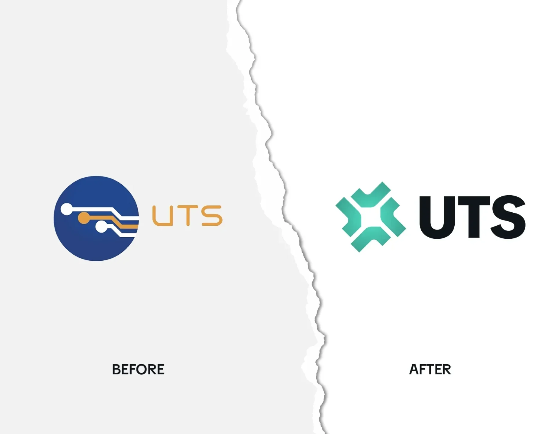
The UTS rebuild started from this problem. The DC-area contractor builds SCIFs, data centers, and secure facilities for federal clients, but after decades of success its brand and website undersold the work.
When we rebuilt the UTS brand, we rewrote the site’s messaging in the language defense and government buyers use. A line like “Where Classified Work Gets Built” says it in five words.
The lesson applies well beyond defense. Your buyer arrives with their own vocabulary. If the headline uses yours instead, they have to translate, and many won’t bother.
Paid search grades this too. Google Ads lists landing page experience as one of the three components of Quality Score, alongside expected click-through rate and ad relevance.
Messaging is also the cheapest brand fix to measure. You can A/B test a new headline next week and watch conversion rate respond.
Test your page:
- Cover the logo. Can a stranger name your service?
- Does the headline use your buyer’s words or your internal ones?
- Does the page match the promise of the ad that sent the click?
- Is there one clear next step, or five competing ones?
If the words pass and the page still underperforms, the problem may be structural. That’s a website redesign question, not a copy question.
Would someone recognize your ad with the logo covered?
An ad builds brand ROI when people know whose it is before they read it. Distinctive color, type, and shapes let each impression build on the last, so retargeting feels familiar. Generic creative resets recognition to zero every time someone scrolls past.
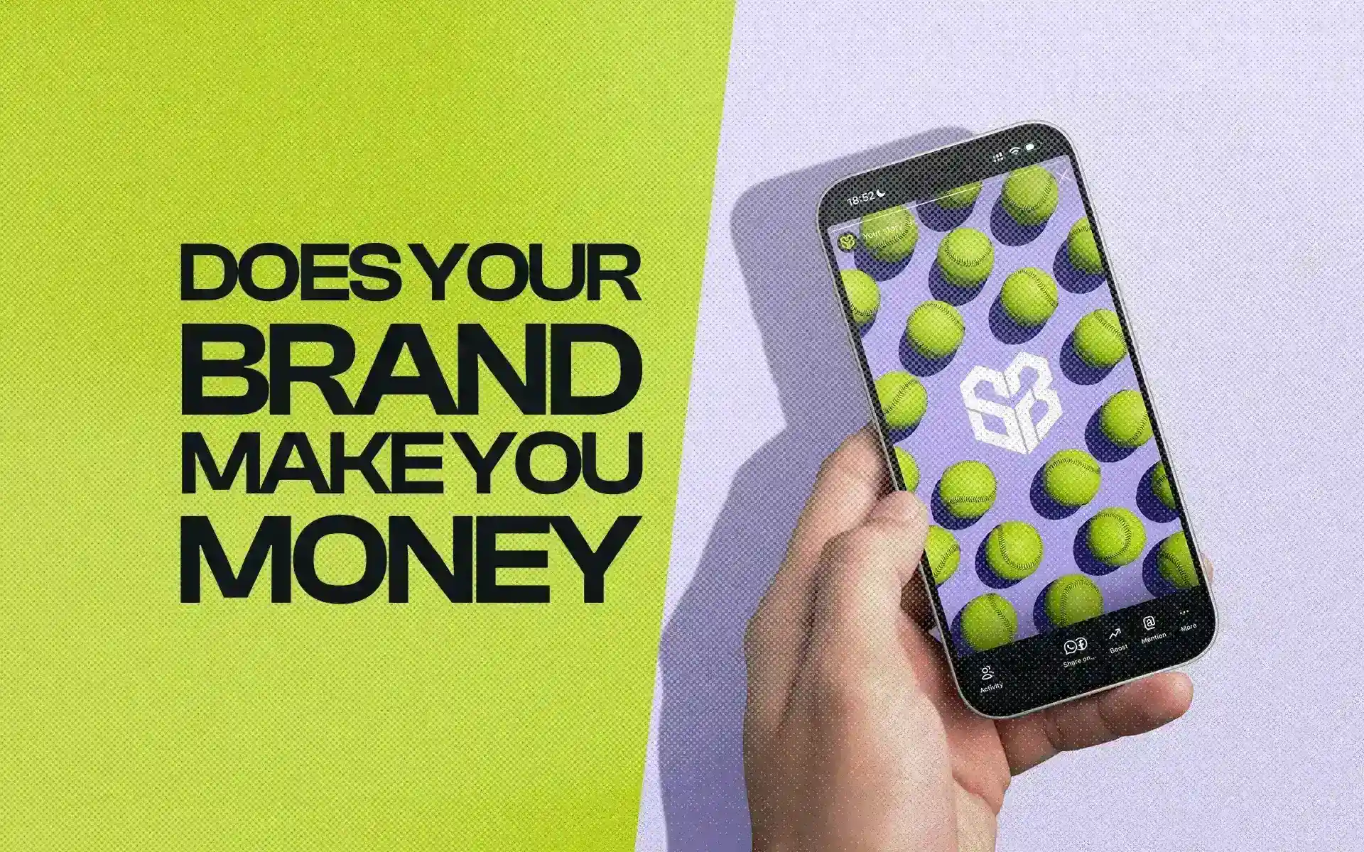
We built SixFour3 from scratch for a growing national girls’ softball franchise. The primary yellow came from the softball itself, a color every player and parent already connects to the sport. Social posts pair it with high-contrast color, bold type, and 3D animated softballs that anchor the text.
That’s the bar: a thumb should stop on the color before the eye finds the name. A brand identity system is what makes that repeatable.
SixFour3 social posts with yellow, bold type, and 3D animated softballsAlt text: SixFour3 brand identity applied to social media content
Product brands face the same test. For Platinum LED, the 3D product models behind an interactive 360-degree web viewer were extended into organic social, paid social, and digital signage. A shopper sees the product rendered the same way wherever they meet it. You can see more of that approach in our 3D product animation work.
Platinum LED 3D product render with bold moving background typeAlt text: Platinum LED 3D product animation for paid social
A recognizable system usually includes:
- One primary color your category doesn’t already own
- A type style bold enough to read at thumb speed
- A recurring visual device, such as a shape, an object, or a motion
- Rules for how those pieces combine, so each new ad doesn’t start from scratch
That last item is how you fight creative fatigue without losing recognition. You make new ads inside the same system.
Does your ad video show what your brand means?
Ad video earns attention when it shows what a brand means instead of listing what it offers. Feature lists invite comparison shopping. A real moment on camera gives viewers a reason to care, which makes the landing page that follows an easier yes.
You can see this in More Than Softball, a SixFour3 brand film built around a real, unscripted father-daughter relationship: car rides, early mornings, practice. We shot it handheld at golden hour, added film grain for a home-movie feel, and cut every stat. The same approach carries over to a 15-second paid social cut.
Golden-hour still from More Than SoftballAlt text: SixFour3 More Than Softball brand video, father and daughter at practice
A short ad doesn’t have room for both meaning and a spec sheet. Let the video do one job and the landing page do the other.
For a short-form cut:
- Open on a real moment, not a logo animation
- Leave stats out and let the landing page carry them
- Keep one person or relationship at the center
- Save the offer for the final seconds
Getting that moment on camera is a casting and directing problem as much as an editing one. It’s where brand video production decisions start, long before anyone opens an ad manager.
Which brand ROI fix should you start with?
Start with the test that maps to your weakest campaign number. A high bounce rate points to landing page messaging. Weak retargeting points to recognition. Low video completion points to creative that lists features instead of showing meaning. Fix one, measure it, then move to the next.
| Test | Where it shows in your numbers | First fix |
| Landing page clarity | High bounce rate, low conversion on paid traffic | Rewrite the headline in your buyer’s words |
| Recognition without the logo | Retargeting performs like cold traffic; creative fatigues fast | Commit to one color, one type style, one visual device |
| Video that shows meaning | Viewers drop off before the offer | Recut around a real moment and cut the stats |
If two tests fail, start with the landing page. Every paid click lands there, so fixes compound across every channel at once.
For the wider business case behind these choices, see the ROI of getting design right.
Make Every Click Land on a Brand Worth Buying From
Run the three tests on your current campaign and fix the weakest one first. If you’re not sure which one that is, start with the landing page, because every dollar you spend ends up there.
Design Noon is a creative agency based in Washington, DC, with a studio in Fairfax, Virginia, that builds brand identity, websites, animation, and video.
If your brand undersells your work, talk with Design Noon about ad creative, landing pages, and video built to convert.