SixFour3 Branding
Building an Iconic, High-Visibility Brand System for Fastpitch Softball Franchises
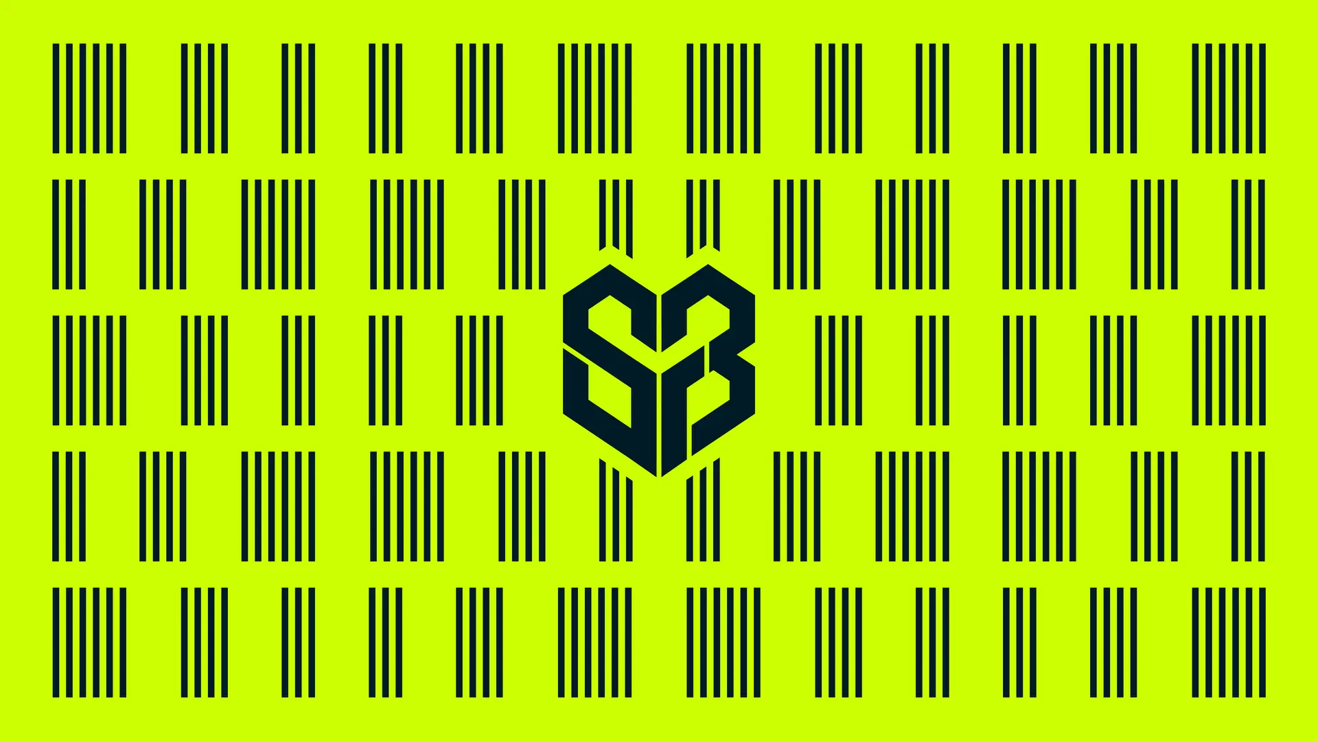
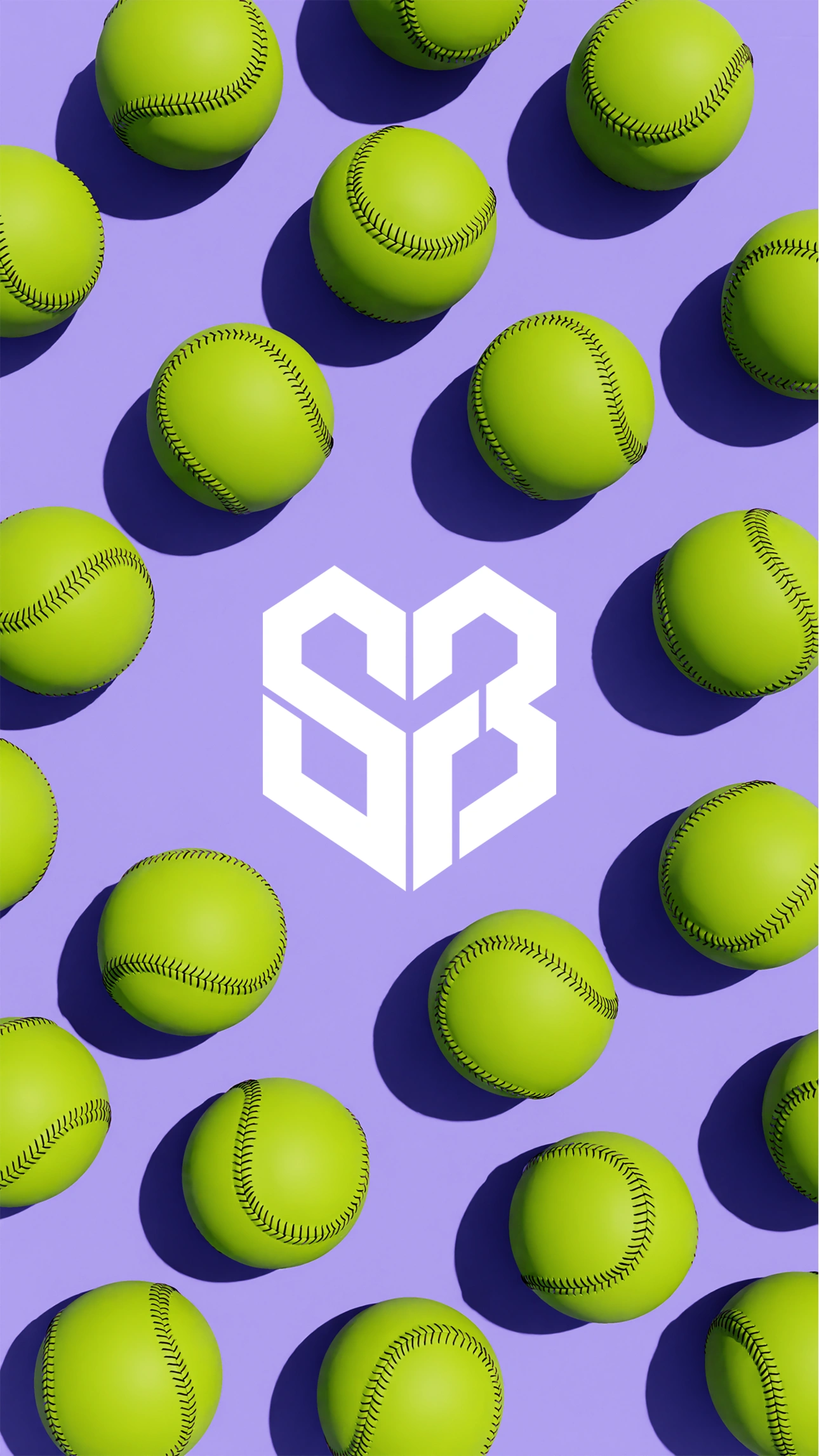
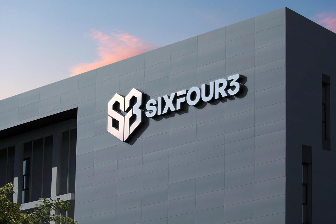
SixFour3 is more than a softball program—it’s a growing national franchise for girls looking to compete at the next level. Design Noon built the brand identity from the ground up: logo, color, and a visual system built to travel, so every new SixFour3 location shows up looking like part of something bigger.
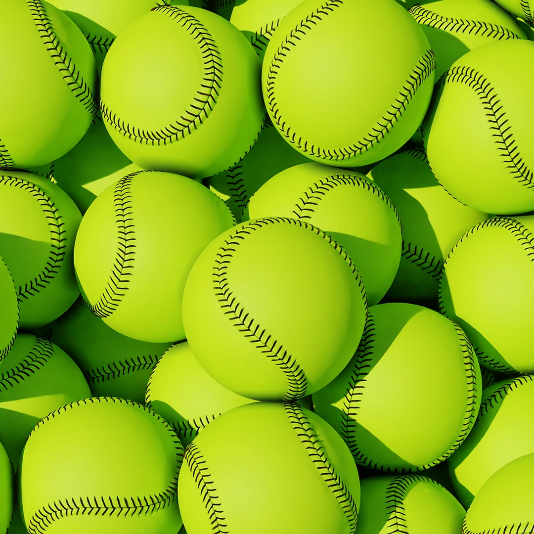
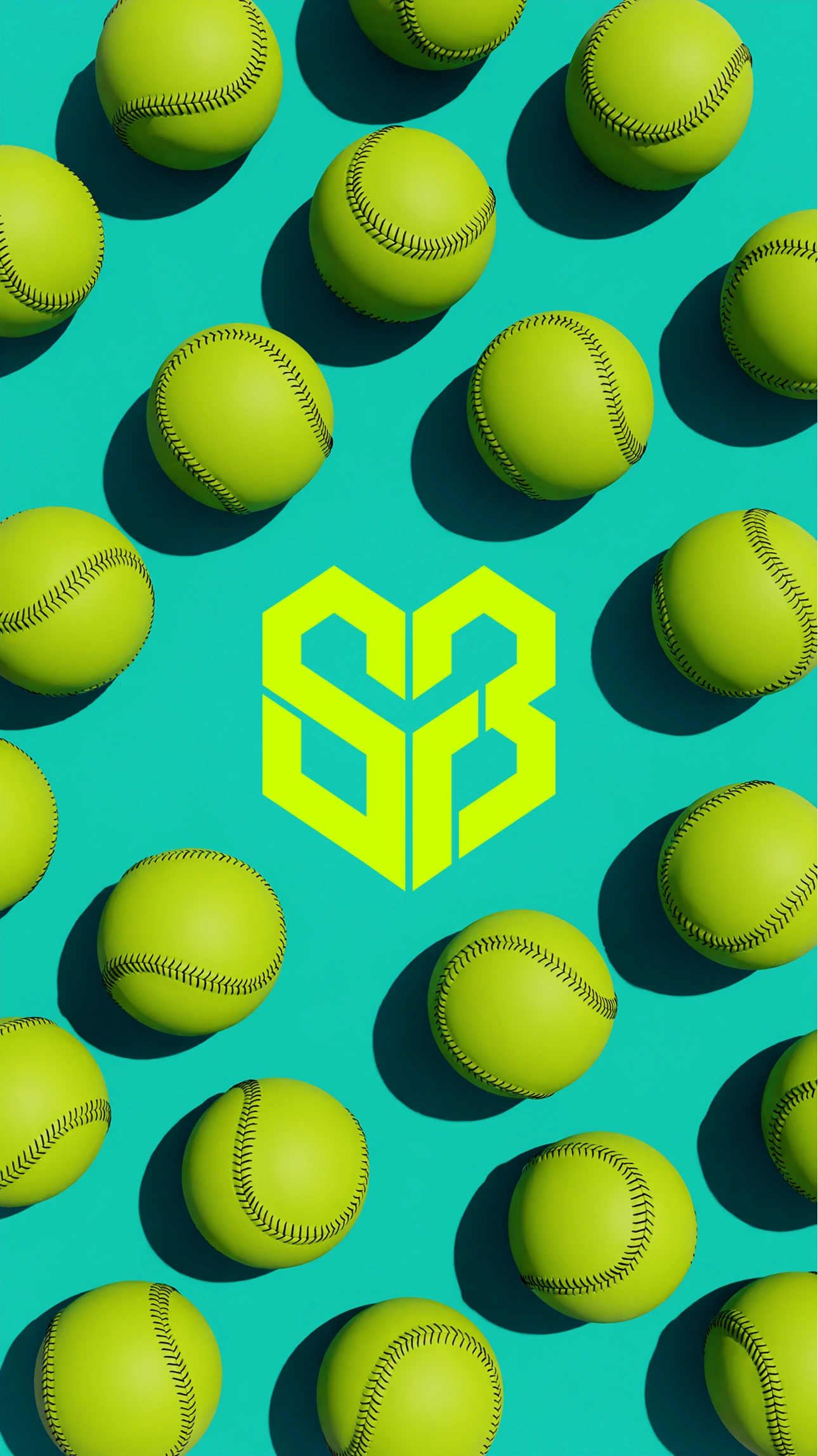
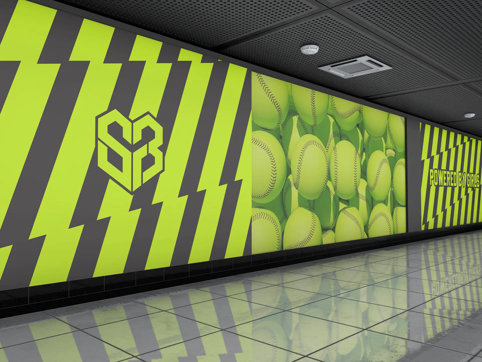
The yellow was an easy call. It’s the same color as the softball itself, so instead of picking a shade that felt arbitrary, we built the identity around a color that’s already tied to the sport in every player and parent’s mind. Made a natural anchor for the whole brand, and it makes SixFour3 instantly recognizable and impossible to miss!
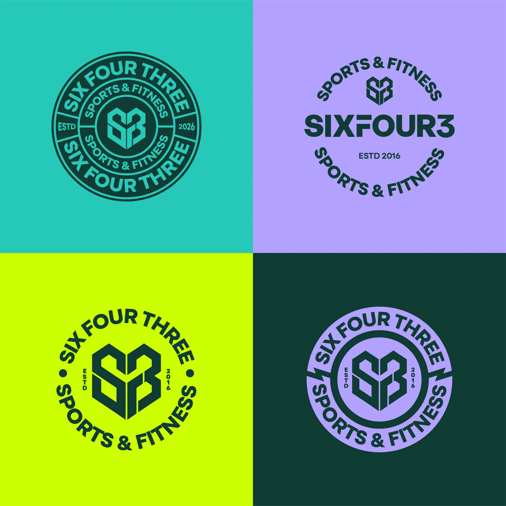
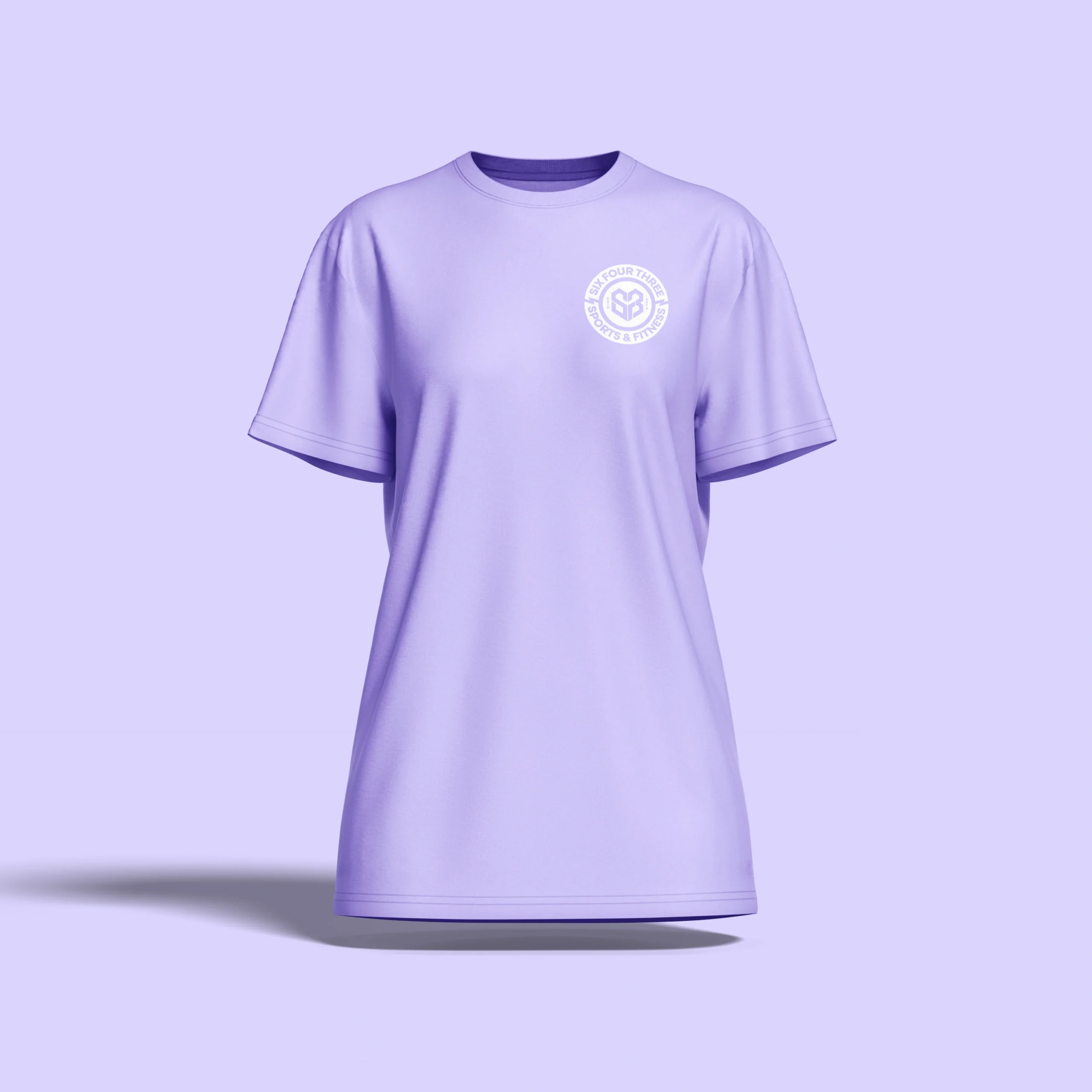
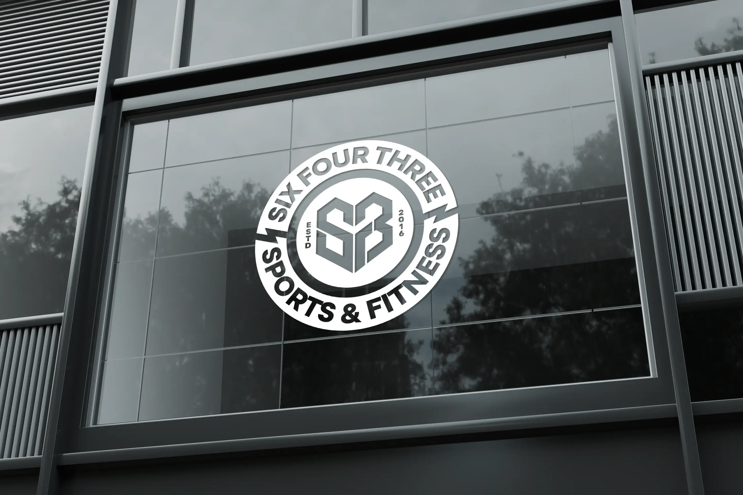
Alongside the primary logo, we designed four circle badge variations, each built to carry the SixFour3 identity into tighter spaces. The badge format is endlessly flexible—it works as a hat patch, a t-shirt print, a sticker, or a signage mark—giving the franchise a set of go-to options that stay consistent no matter where they show up.
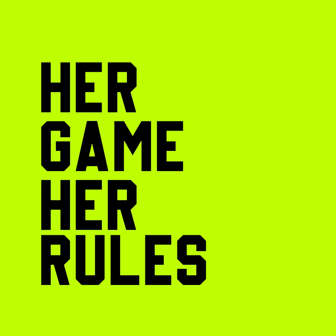
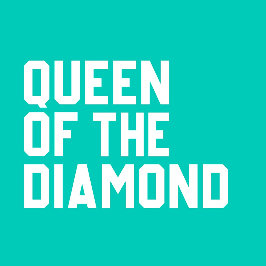
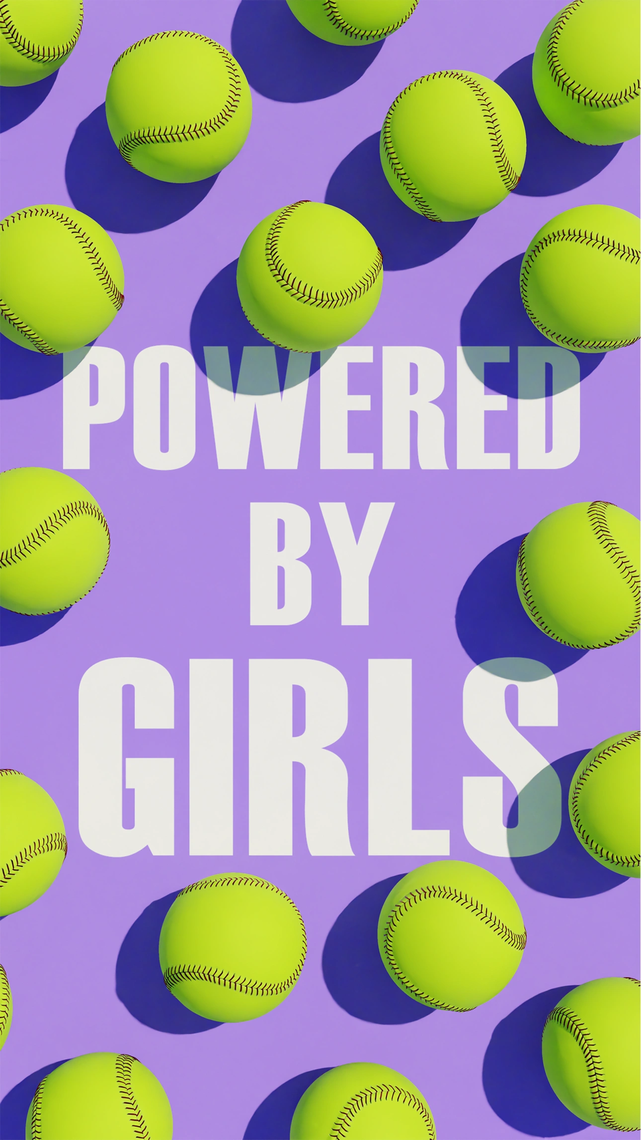
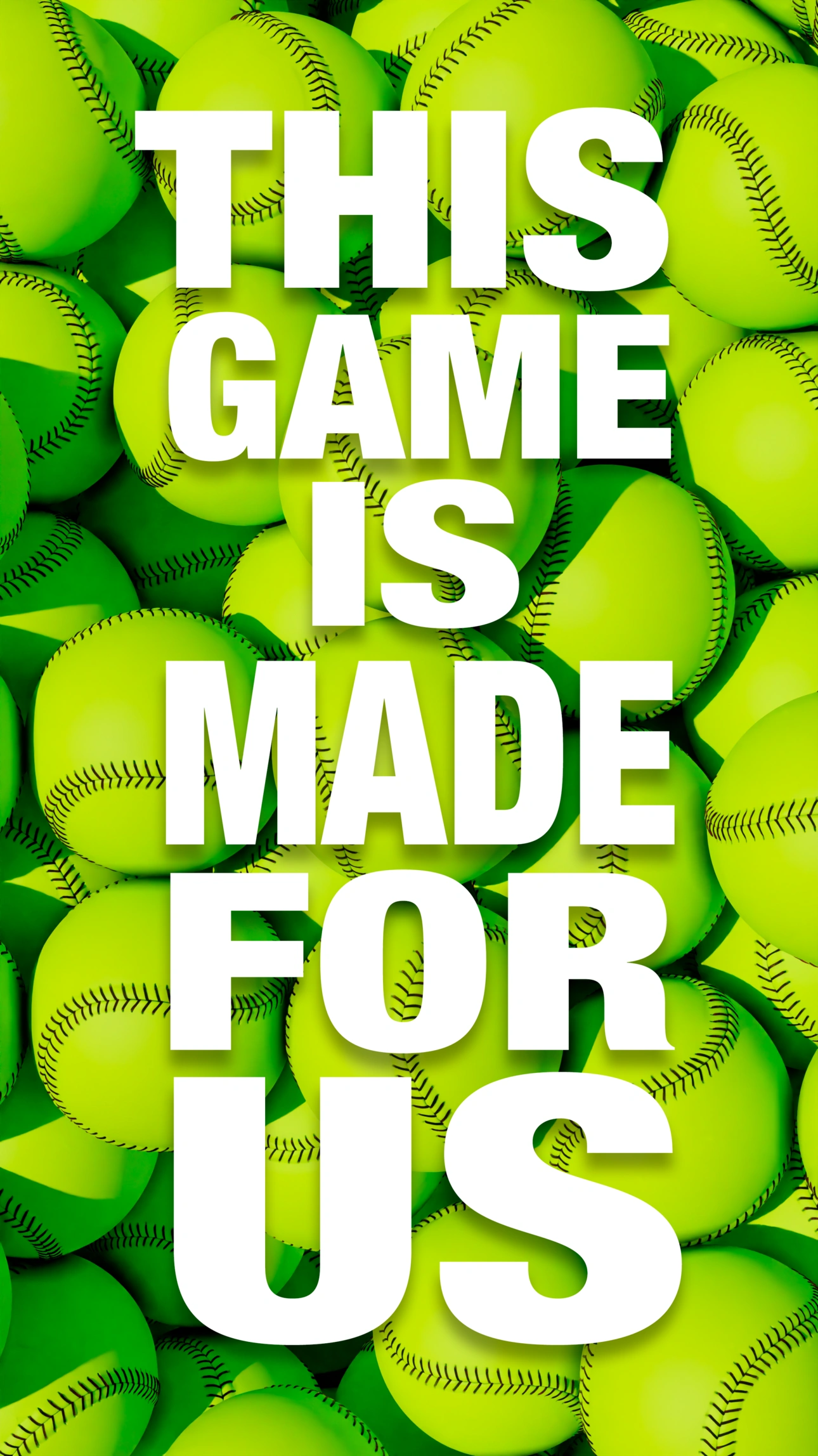
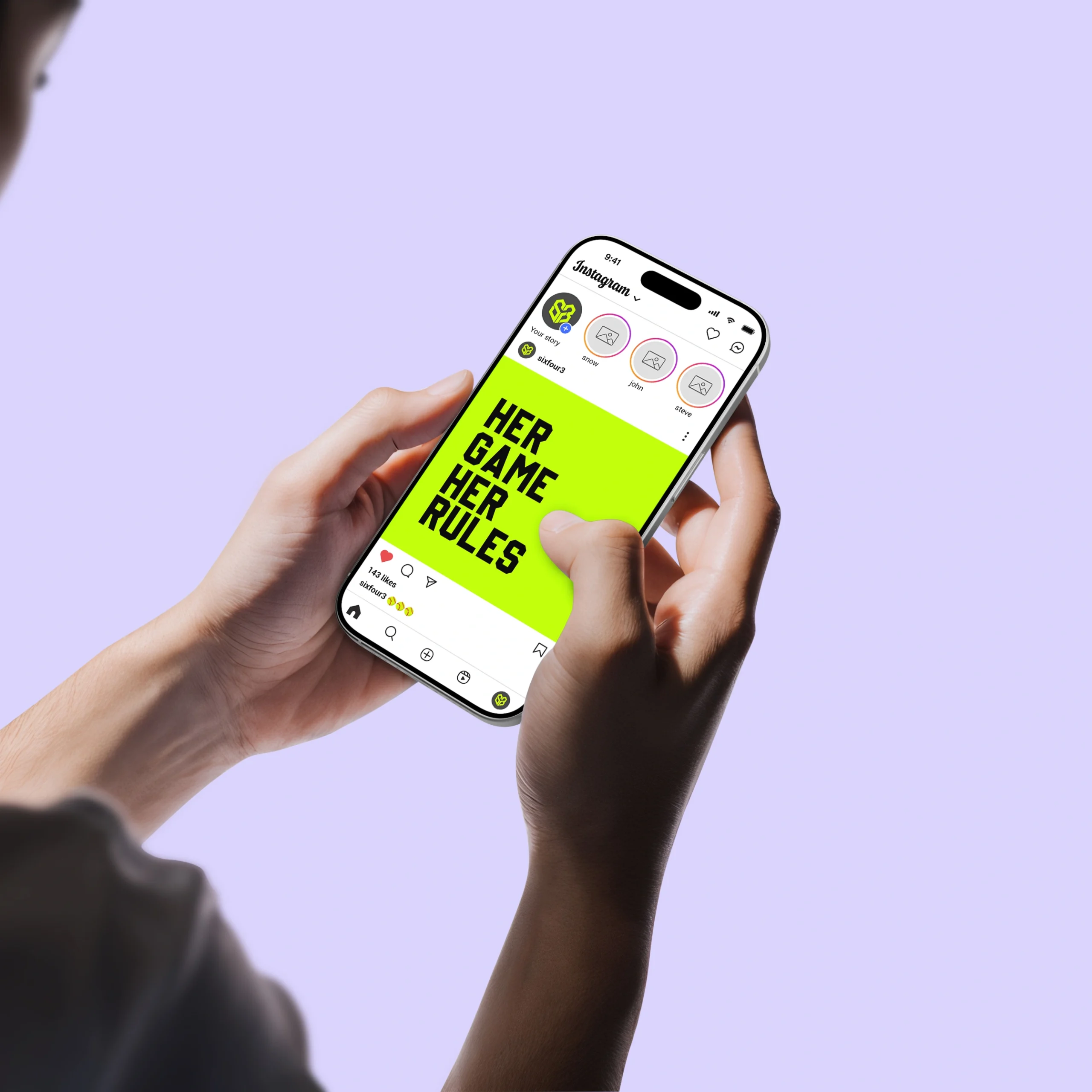
Alongside the visual identity, we expanded SixFour3’s messaging to give the brand more ways to speak. “Powered by Girls” remains the anchor line, joined now by “Her Game, Her Rules,” “Queen of the Diamond,” and “This Game Was Made for Us”—a set of taglines built to flex across social content, signage, and merch while keeping the same confident, girls-first voice at the center of it all.
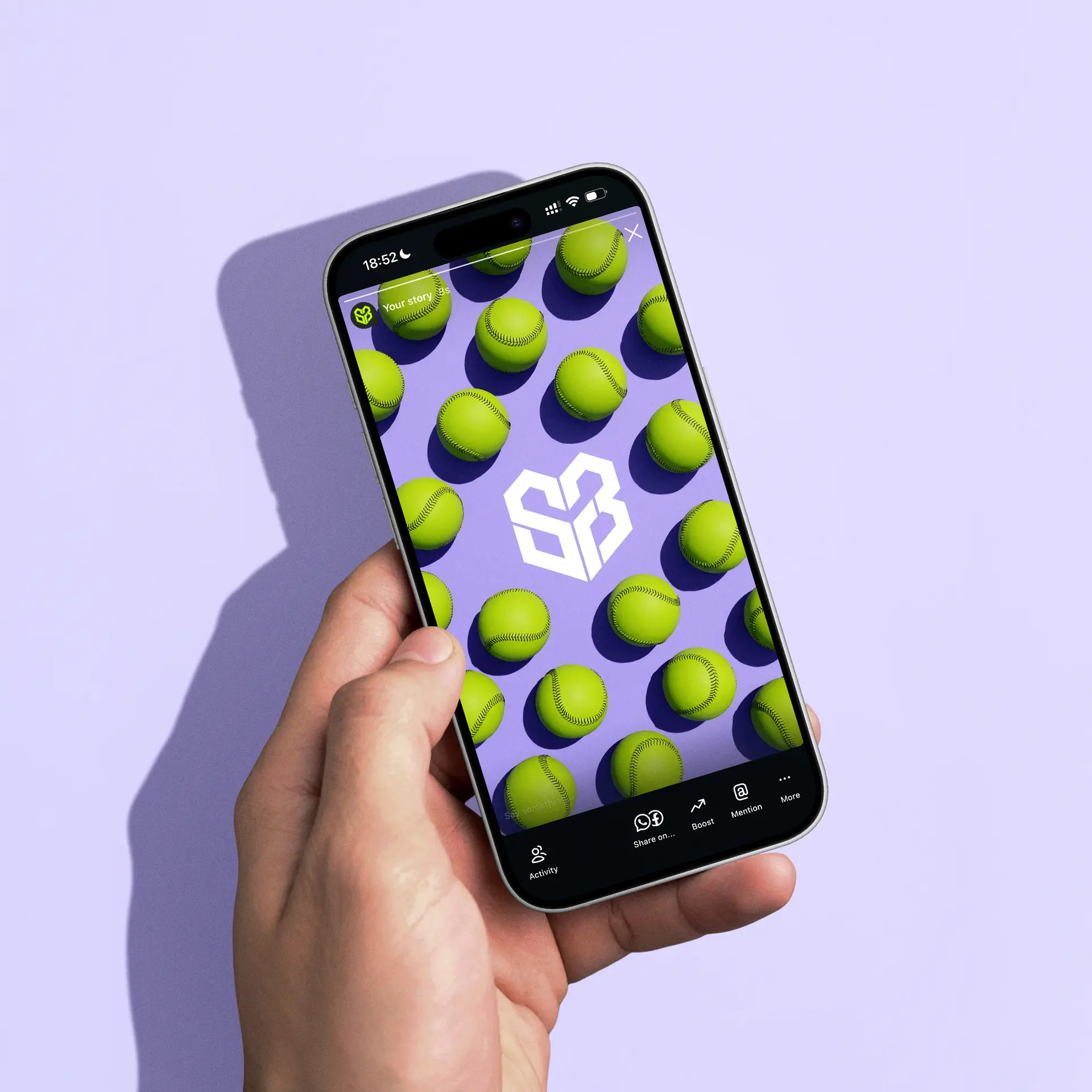
To bring the messaging to life, we built 3D animated softballs that act as anchor points for the type—simple, clean compositions where the ball itself does the visual heavy lifting instead of busy backgrounds or clutter. It keeps the focus on the words and the product, giving each piece a minimal, confident look that still feels unmistakably SixFour3.
Every piece of the new branding was built with one goal in mind: stand out. Social feeds move fast, so we leaned into bright, high-contrast color and bold type that grabs attention mid-scroll, giving SixFour3 a look that reads clearly at a glance and holds up against a crowded field of content.
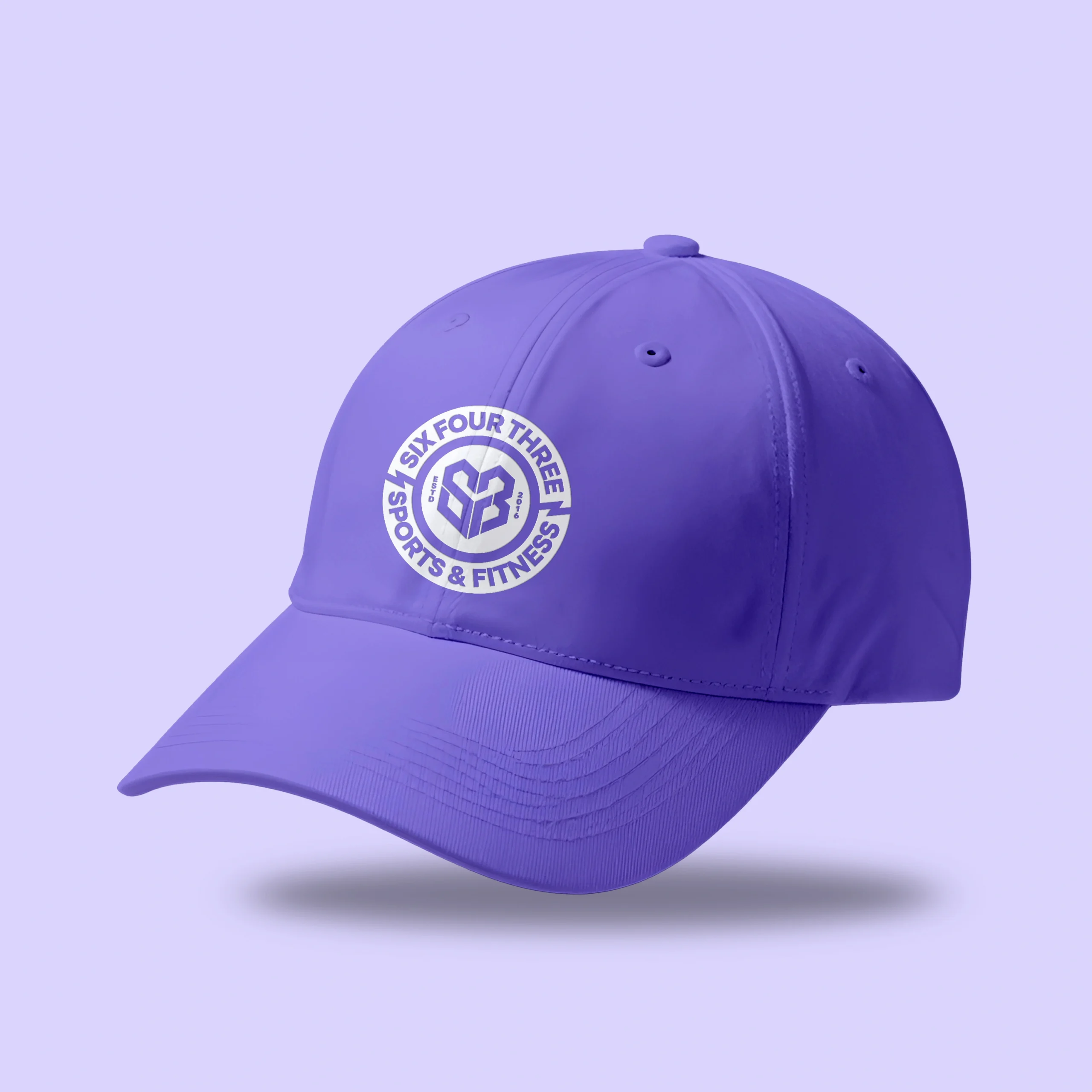
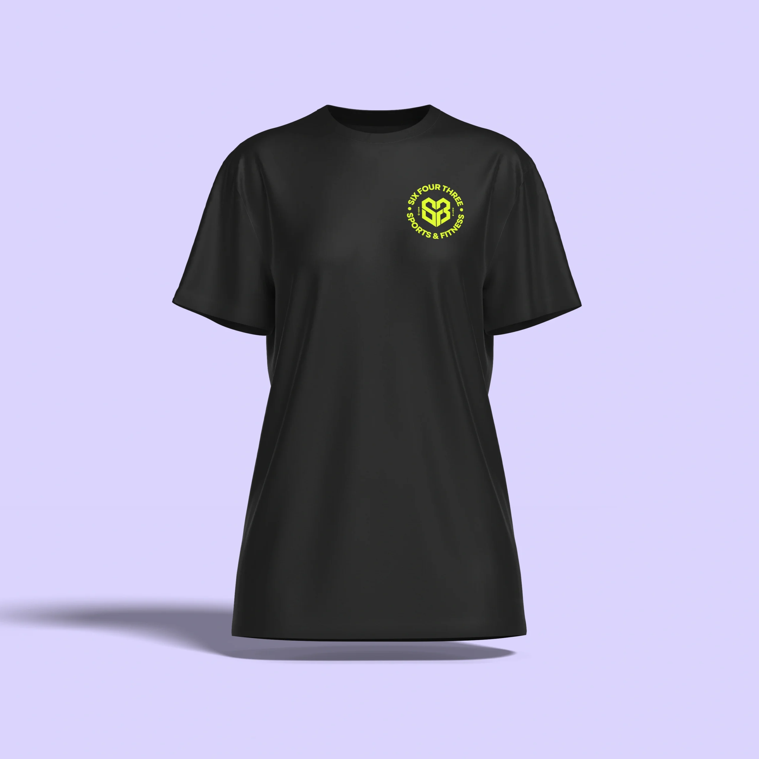
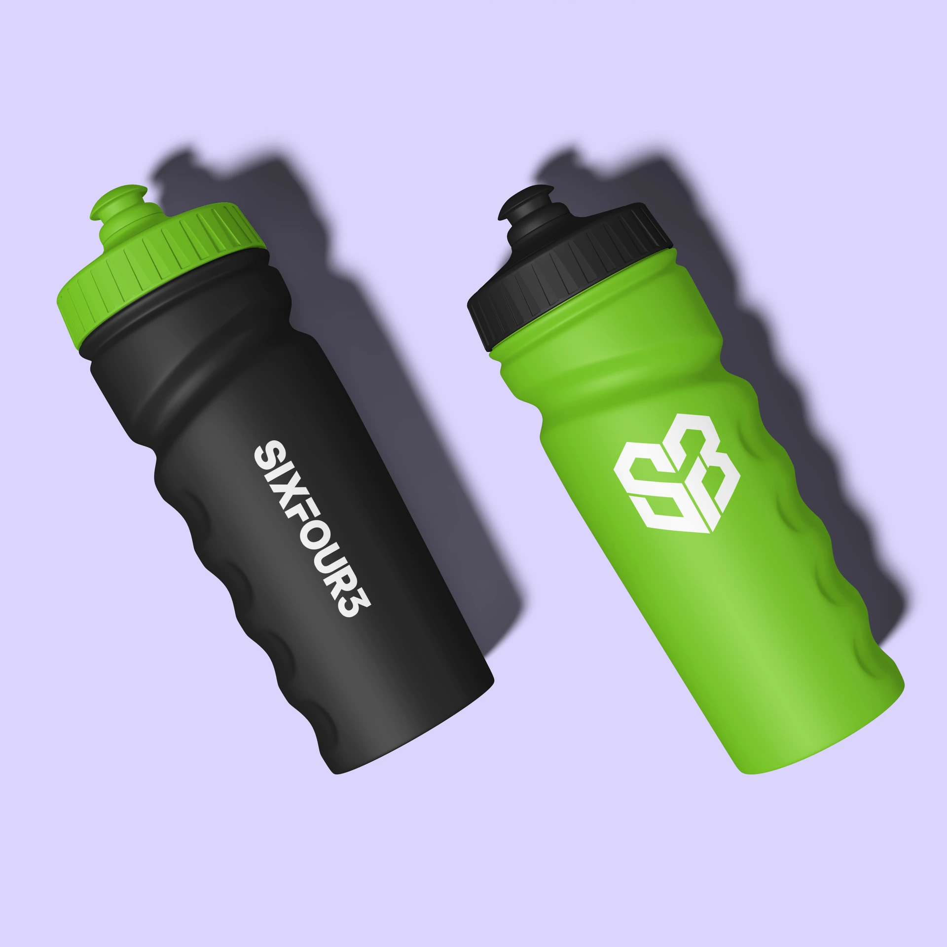
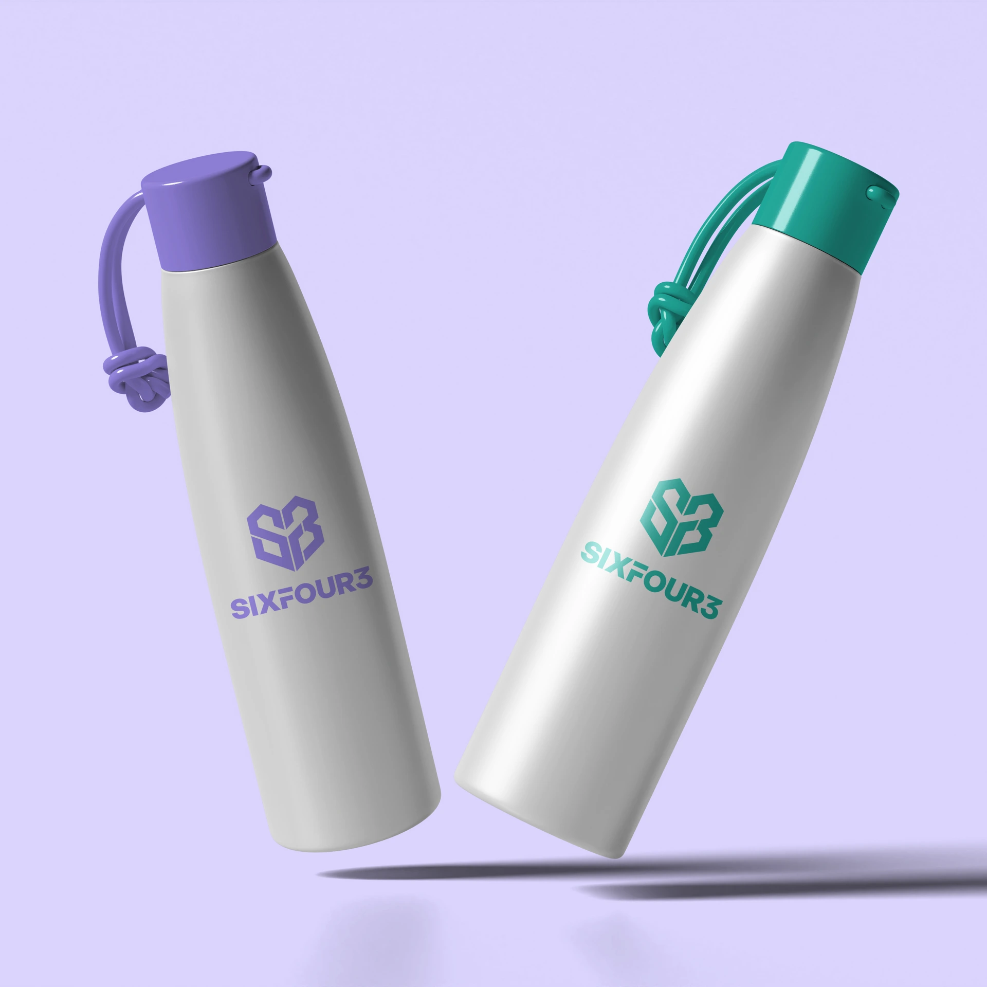
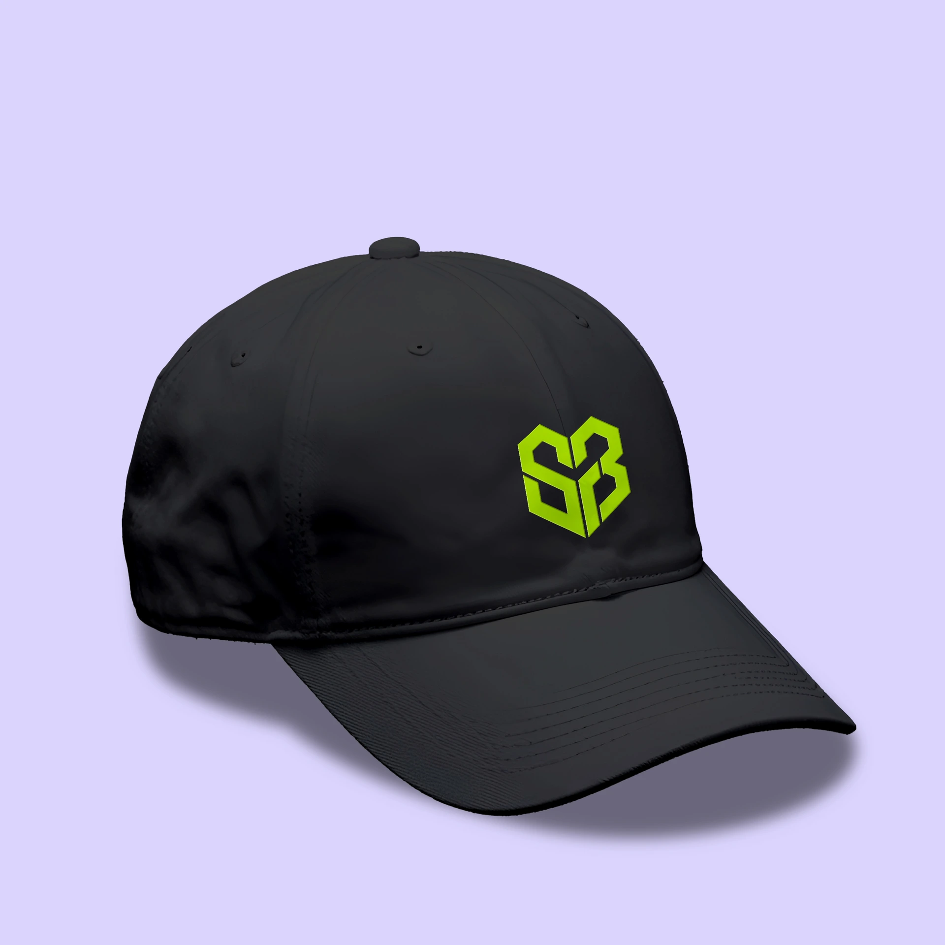
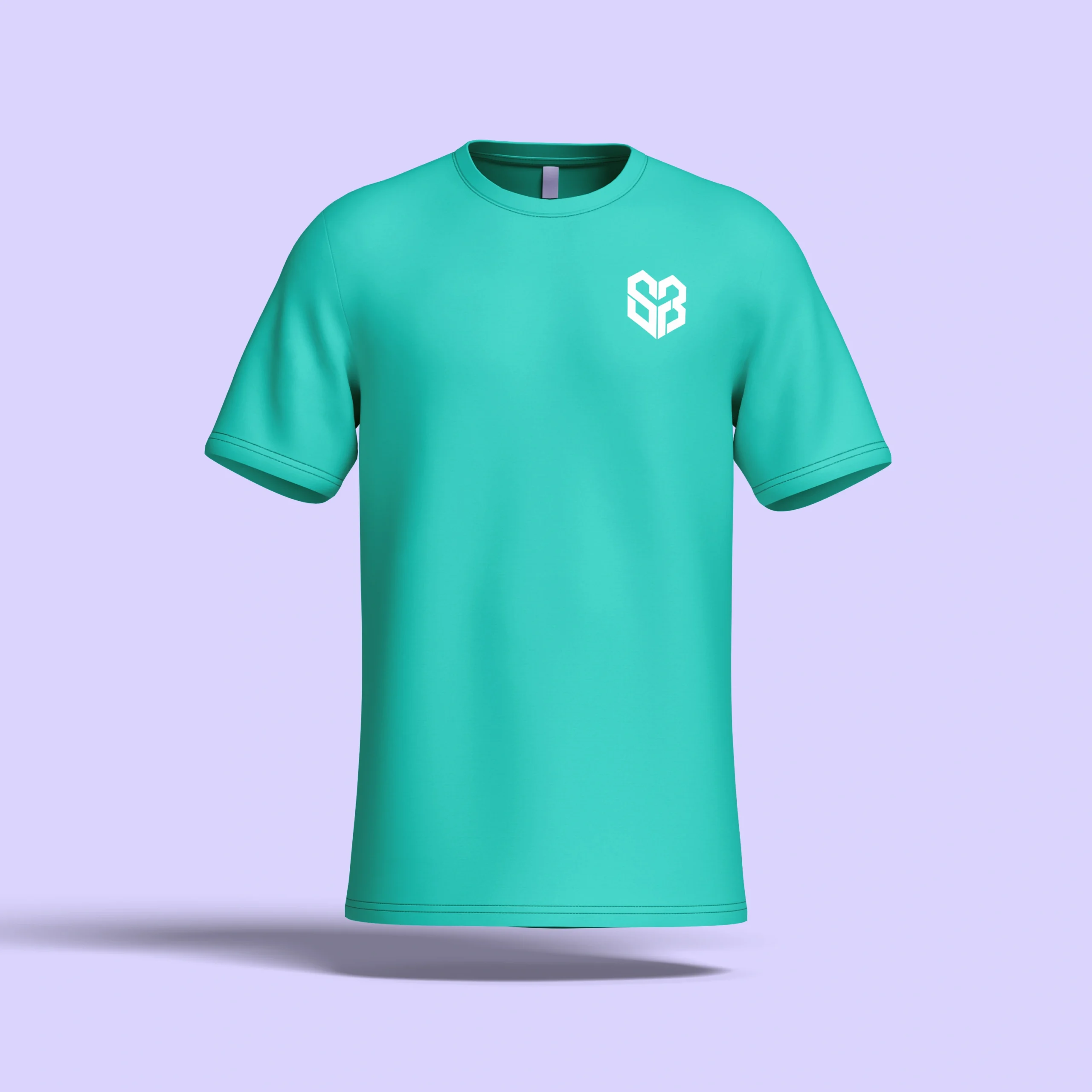
The branding was designed to work as hard on a hanger as it does on a screen. We carried the logo suite, badges, and color palette through a full merchandise line—t-shirts, hats, and more—so SixFour3 gear feels like an extension of the brand rather than an afterthought, giving players and families something they actually want to wear.
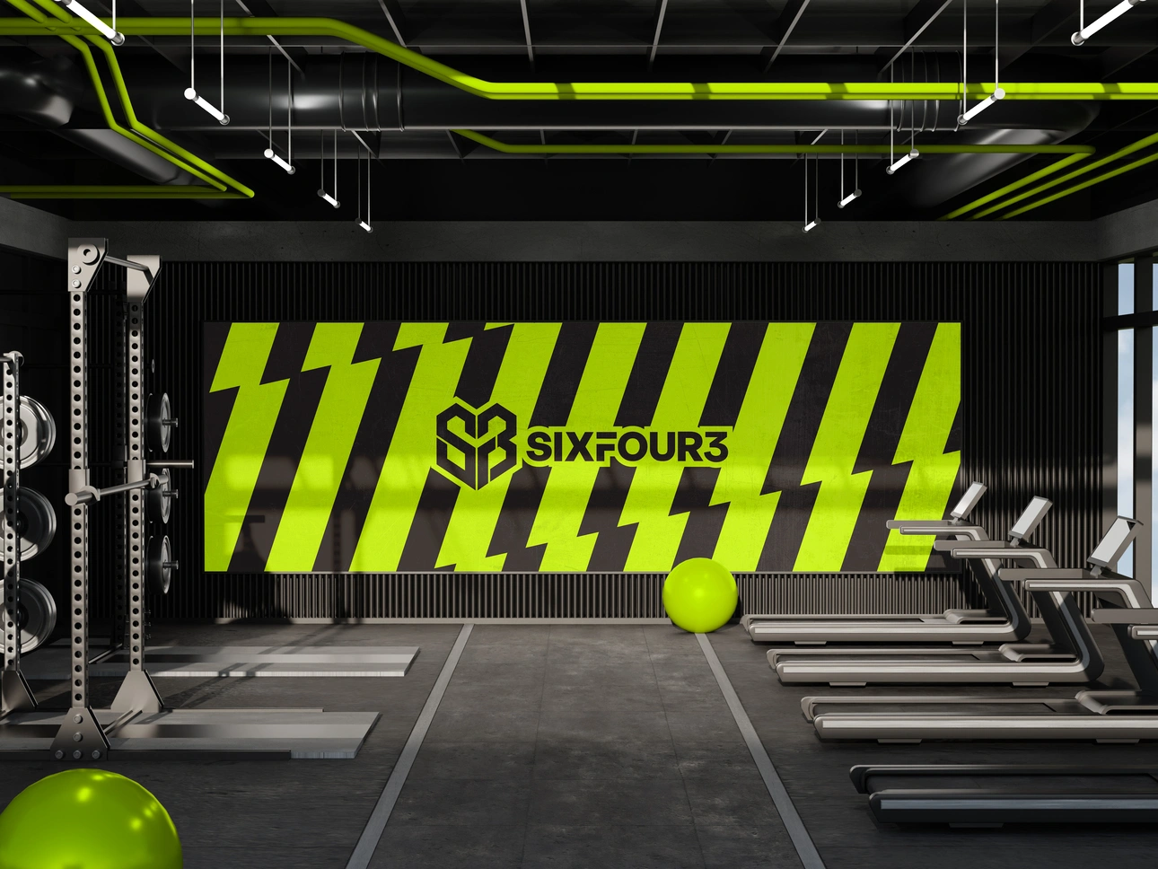
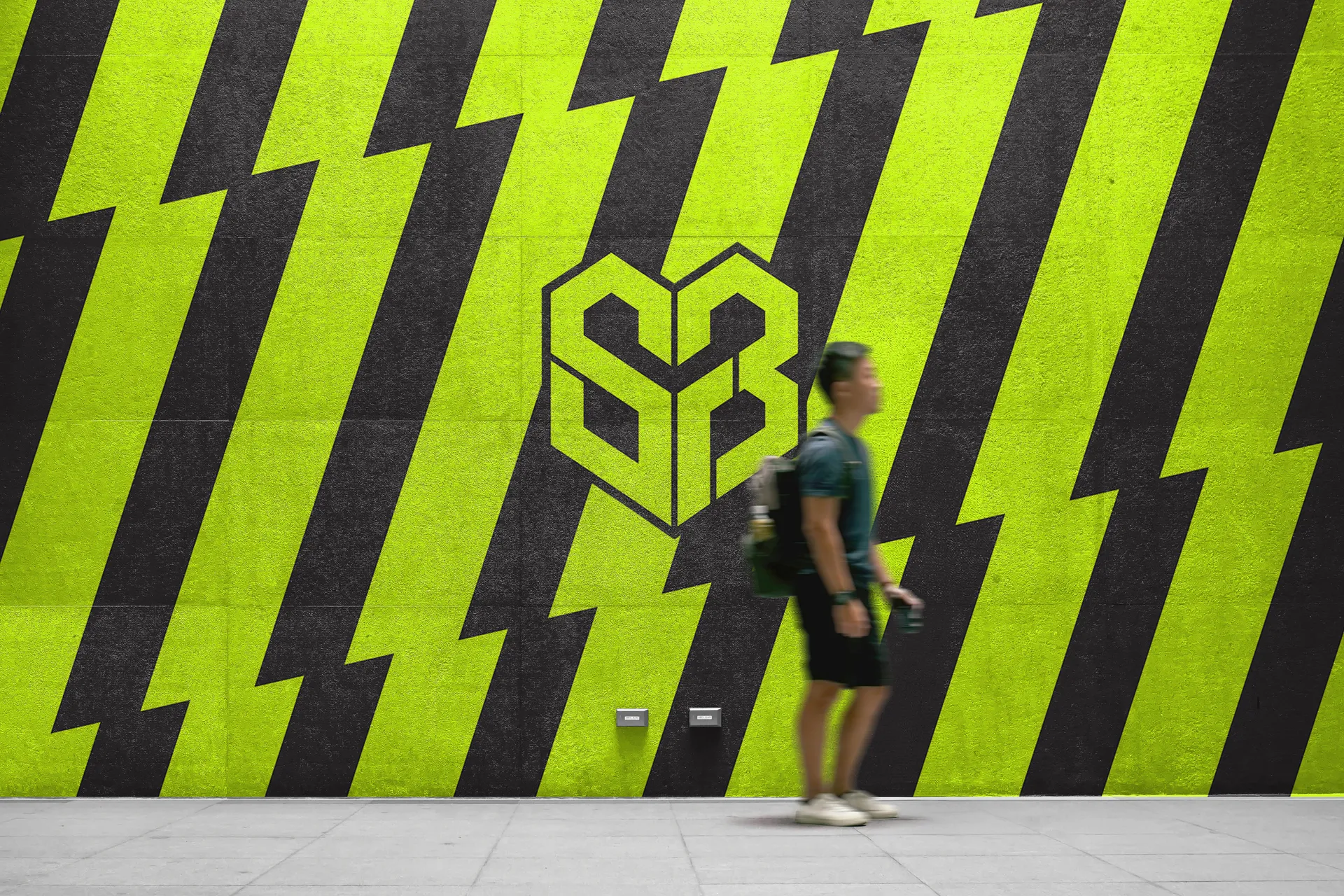
We also extended the branding into physical signage for SixFour3’s locations, including vinyl stickers applied directly to glass windows and doors. It’s a simple touch that makes a big difference—turning an ordinary storefront into something instantly recognizable, so every location feels like SixFour3 from the moment someone walks up.
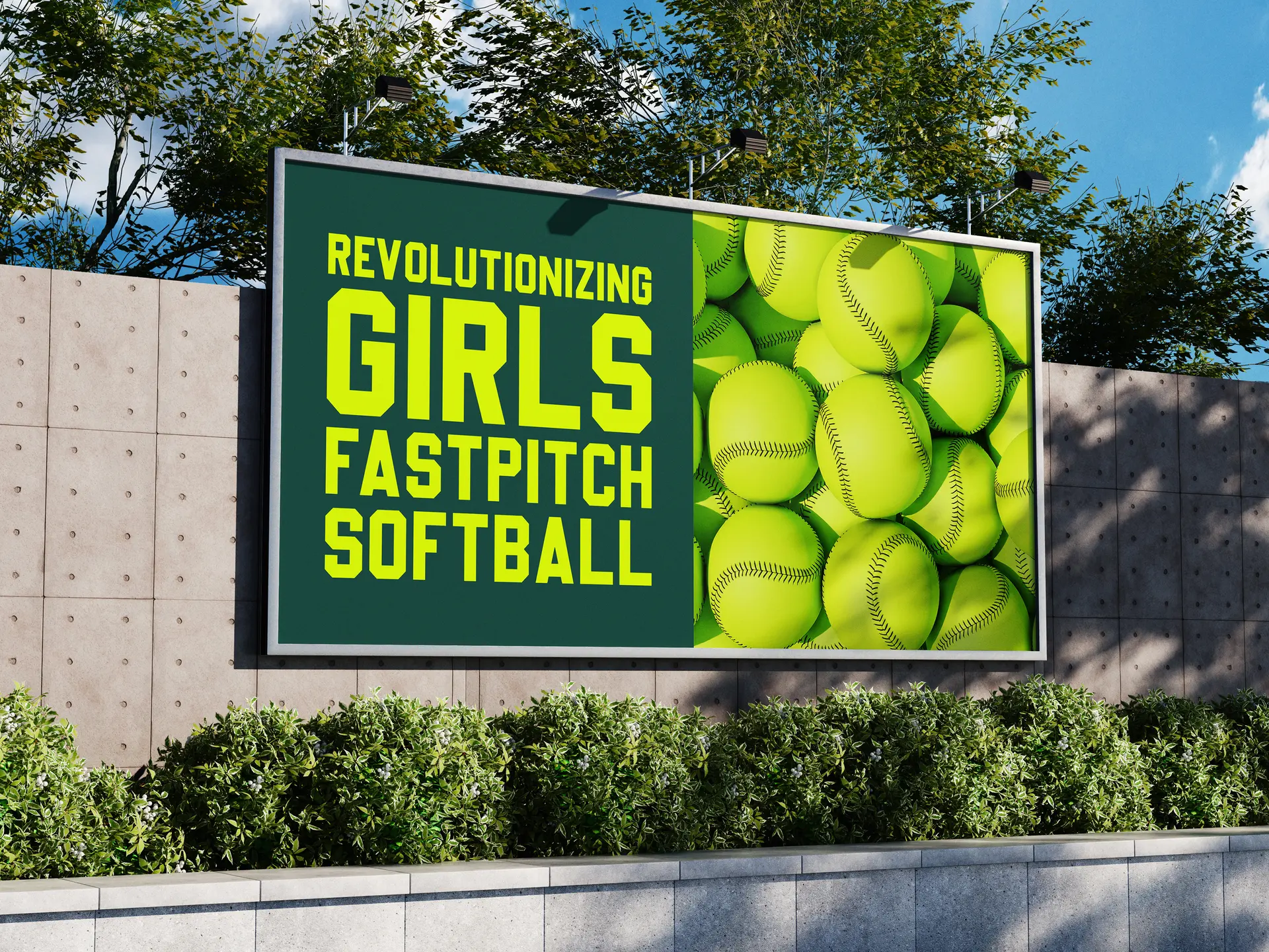
We took the identity into print advertising as well, including billboards and other physical signage built to make an impact in new markets. The same bold, high-contrast look that works on social translates just as well at scale, keeping SixFour3 recognizable wherever it shows up.
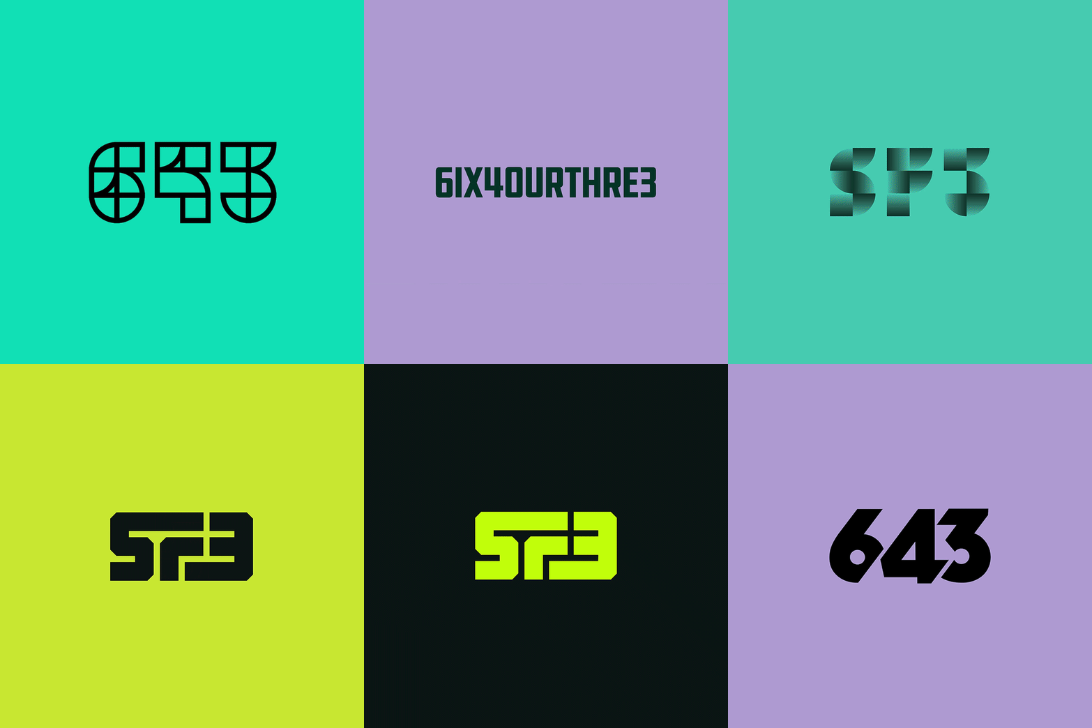
The animation above cycles through some of the logo concepts we explored before landing on the final SixFour3 identity—a small window into the process behind the brand. Projects like this are exactly why we love the work: getting to build something from the ground up and watch a brand step into a whole new level.