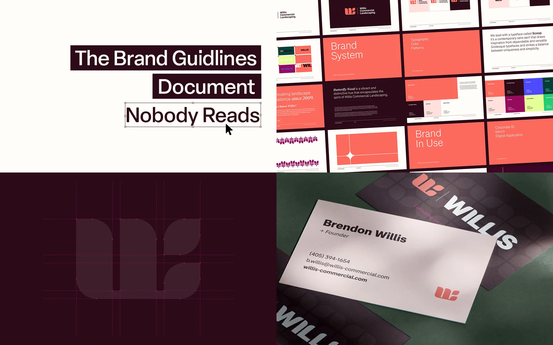
Somewhere on a shared drive, in a folder called “Brand,” sits a 64-page PDF. It cost real money. It was presented with a flourish, applauded in a conference room, and then forgotten.
Six months later, a sales rep is building a deck with a logo pulled from an old email signature. A marketing coordinator is picking “a blue that looks close enough.” The web team is using a font that appears nowhere in the guidelines because the guidelines never mentioned web.
Nobody is being careless. The document just wasn’t built to be used.
If you run marketing for a growing organization in the Washington DC area, you have probably lived some version of this. Here is why brand guidelines fail, and what the ones that work do differently.
Why Brand Guidelines Get Ignored
Brand guidelines fail for a boring reason: they are written for the people who made the brand, not the people who have to live with it.
They document the logo, not the decisions. A page showing your logo with clear-space measurements is useful. But most brand problems don’t happen at the logo level. They happen when someone has to write a LinkedIn caption, lay out a one-pager, or choose a photo. The guidelines are silent on all three.
They read like a legal document. “Never” and “must” appear on every page, and there is little explanation of why. People follow rules they understand and route around rules they don’t.
They can’t be found in the moment. A 60-page PDF is a poor tool for answering “what color is our button?” at 4:45 on a Friday. If the answer takes five minutes to find, people guess.
They were finished on delivery day. Brands keep growing. New channels, new services, new team members, and new formats show up constantly. A static document starts aging the moment it’s exported.
What a Usable Brand Guidelines Document Looks Like
Good guidelines behave less like a rulebook and more like a working tool. A few principles separate the two.
1. Start with the “why,” then the “what”
Before any swatches or type specimens, explain what the brand is trying to do and who it is for. When someone understands the intent, they can make a sensible call in situations the document never anticipated. That is the whole point: guidelines exist to help people decide well when nobody is available to ask.
2. Show real applications, not just components
A color palette in isolation is abstract. The same palette applied to a proposal cover, a social post, a trade show banner, and a landing page is instructive. The best guidelines are full of real, finished examples, and they include a few “almost right, but not quite” comparisons so people can see where the line sits.
3. Cover the channels where the brand actually lives
Print-era guidelines often stop at stationery and signage. Today your brand also appears in:
- Website and landing pages
- Social media templates and profile assets
- Email campaigns and digital ads
- Video, motion graphics, and animation
- Presentations, proposals, and sales collateral
If motion is part of your brand, the guidelines should say how things move. If your team publishes video, they should say how to open and close it. A brand identity that only works on paper is only half a brand.
4. Write voice guidance people can borrow from
“Confident but approachable” appears in nearly every brand document ever produced, and it helps almost no one. Useful voice guidance shows before-and-after sentences, lists words you use and words you avoid, and gives examples for different situations: a proposal, a social post, an apology email.
5. Make it a living system
The strongest brand guidelines are not a PDF at all, or at least not only a PDF. They are a set of assets your team actually reaches for: editable templates, organized logo files, a color and type reference that is quick to scan, and a clear owner who keeps it current. Think toolkit, not tome.
The Web Is Where Guidelines Break First
If you want to test whether your brand guidelines are working, look at your website.
Websites are built by multiple people over multiple years, so they are the first place inconsistency shows. A button style gets invented for one page and copied to twelve. Heading sizes drift. A photography style shifts halfway through the blog.
This is why brand guidelines and web design and development should not be separate conversations. The strongest brand systems translate into reusable components (buttons, headings, cards, spacing), the same approach behind public design systems like Google’s Material Design, so the site stays coherent even as it grows. When the brand and the website are designed together, your guidelines stop being a document and start being the way things are built.
Who Should Own the Guidelines?
Someone has to. The most common failure isn’t bad design; it’s no ownership.
Whoever owns the guidelines should be able to answer three questions:
- Where is the current version, and does everyone know how to reach it?
- Who approves exceptions?
- When was the last time it was updated?
For many organizations, especially lean marketing teams, the practical answer is to pair internal ownership with outside creative support. That’s one reason many companies choose an ongoing design retainer: a dedicated creative partner who already knows the brand can build new assets, update templates, and keep everything consistent, often at a lower cost than a full-time hire.
A Quick Self-Audit
Try this with your own team. Ask five people, from different departments, to do the following without help:
- Find your primary logo file in under two minutes.
- Name your brand’s two main colors.
- Describe your brand voice in one sentence.
- Say which template to use for a new presentation.
If the answers vary, or people can’t answer at all, the problem isn’t your team. It’s the tools they’ve been given.
When It’s Time to Rebuild
Consider refreshing your brand guidelines if any of these sound familiar:
- You’ve launched new services, products, or audiences since the last version.
- Your website, social channels, and sales materials look like they belong to different companies.
- New hires ask where things are and nobody is sure.
- You’re moving into video, animation, or new digital channels the guidelines never contemplated.
- You’re preparing for a rebrand, a redesign, or a major campaign.
Guidelines are also the natural foundation for broader work. A clear brand system makes branding and graphic design, video production, and 2D and 3D animation faster, cheaper, and more cohesive, because everyone starts from the same source of truth.
The Point of a Brand Guide
A great brand guide isn’t judged by how it looks on presentation day. It’s judged by whether, a year later, a new hire in another department can produce something that looks and sounds unmistakably like your company, without calling anyone.
That’s the bar. Most documents don’t clear it, but the ones built around real use do.
Build Brand Guidelines People Will Actually Use
Design Noon is a full-service creative agency serving organizations across the Washington DC area, from identity and web to motion and animation. We build brands that hold up in the real world, and we build the systems that keep them consistent.
Want to see how we approach branding? Browse our recent work, including brand projects like Beachwalk and Willis Landscaping, or get in touch to talk about a brand guidelines refresh for your team.