Every few months, a company comes to a creative agency wanting a rebrand, and the brief opens the same way: “We need a fresh look. New colors, new logo, maybe a new font.”
Sometimes that’s exactly right. More often, the visuals are fine and the real problem is that the brand doesn’t sound like anyone. The website says one thing, the LinkedIn posts say another, the proposals read like they came from a third company, and no color palette can hold that together.
Here’s the argument: your brand voice matters more than your color palette. Color is how people notice you. Voice is how they decide whether to trust you.
Why Brand Voice Matters and What It Actually Is
Brand voice is the consistent personality behind everything your company says: word choice, sentence rhythm, what you’ll joke about and what you won’t, how you handle a complaint, how you write a button label.
It’s often confused with tone. The distinction is simple. Voice is who you are, and tone is how that shifts by situation. A friend has one voice but a different tone at a wedding than at a funeral. Your brand should work the same way. Nielsen Norman Group has a useful framework for the dimensions of tone of voice (funny vs. serious, formal vs. casual, respectful vs. irreverent, enthusiastic vs. matter-of-fact) if you want a vocabulary for it.
Why color gets too much credit
Color palettes are easy to talk about, easy to present, and easy to approve in a meeting. That’s why they dominate branding conversations. But they have real limits:
- Color can’t explain anything. A navy-and-gold palette says “established” and nothing else. It can’t tell a prospect what you do, who you do it for, or why you’re different.
- Color is easy to copy. Entire industries converge on the same palette: fintech blue, wellness sage, startup purple. When every competitor looks alike, the visual signal disappears.
- Color lives in a narrow set of places. Voice shows up everywhere: search results, emails, customer service replies, sales calls, error messages, the phone tree. Your palette never touches half of those.
None of this means color is unimportant. It means color is a supporting asset, and voice is the structural one.
Voice is what people remember
Think about brands you’d recognize with the logo covered. Chances are you’d recognize the writing: the dry humor, the plainspoken confidence, the way they explain something complicated without talking down to you. Mailchimp’s public content style guide is a good example of a company treating voice as a designed asset rather than an afterthought.
Design Noon’s own positioning makes the same point in visual terms: how you look is how you’re remembered. Voice is the other half of that sentence. A strong identity gets you noticed, and a strong voice makes people believe what they see.
Where voice does the heavy lifting
1. Search and discovery
Your headlines, page titles, and meta descriptions are the first thing a prospect reads, often before they ever see your colors. A clear, distinctive voice in those few lines is the difference between a click and a scroll-past. For businesses competing for local attention, this matters even more. Someone searching for a creative agency in Washington DC is comparing a handful of results side by side, and copy is what separates them.
2. Your website
A website is a conversation you have with thousands of people at once. Visual design gets them in the door, but the copy answers their actual question: “Are these people right for me?” This is why web design and development works best when the words and the interface are planned together instead of pasted in at the end.
3. Consistency across channels
The most common brand problem isn’t a bad logo. It’s inconsistency. When social, email, sales decks, and the website each sound different, people sense something is off, even if they can’t say what. A defined voice lets multiple writers, freelancers, and departments sound like one company. That’s the real job of a brand identity system: visuals and language documented together so they scale.
4. Trust in the moments that matter
Nobody judges your brand on a good day. They judge it when a shipment is late, an invoice is wrong, or a form breaks. Voice is what people hear in those moments, and a brand that stays honest and human under pressure earns loyalty that no palette can.
A quick test: is your voice working?
Try this exercise with your team:
- Cover the logo. Pull five pieces of copy: a homepage headline, a recent social post, an email subject line, a proposal intro, and a support reply. Could a stranger tell they came from the same company?
- Swap the competitor. Paste your homepage headline onto a competitor’s site. If it still works, it isn’t yours.
- Read it out loud. If nobody on your team would say it in a real conversation with a client, rewrite it.
- Write three “we are / we aren’t” pairs. For example: “We’re confident, not arrogant. We’re playful, not flippant. We’re direct, not blunt.” If your team can’t agree on these, you’ve found the gap.
How to build a brand voice that holds up
Start with your audience, not your adjectives. “Friendly, innovative, professional” describes every company on earth. Ask instead: who are we talking to, what are they worried about, and how do they talk about it themselves?
Define it in practice, not principles. A useful voice guide includes example sentences, words you use and words you avoid, and before-and-after rewrites. It should help a new hire write a good email on day one.
Build it alongside the visuals. Voice and visual identity should inform each other. A bold, minimal typographic system suggests short, confident sentences. A warm, illustrated identity invites a looser, more conversational register. When they’re developed together, the whole brand feels intentional.
Stress-test it across formats. Try your voice on a headline, a 15-second video script, a 404 page, and a legal disclaimer. If it only works in the easy places, keep refining.
Keep it alive. A voice guide that sits in a shared drive helps no one. Bring it into onboarding, content reviews, and campaign briefs. If you lack the in-house capacity to maintain that kind of consistency, an ongoing design retainer can keep creative work aligned without hiring a full-time team.
The bottom line
Color gets a brand noticed for a second. Voice keeps it in someone’s mind for years. If you’re weighing a rebrand, spend at least as much time on how you sound as on how you look, and make sure the two are designed as one system.
Work with a Washington DC creative agency that treats voice as part of the design
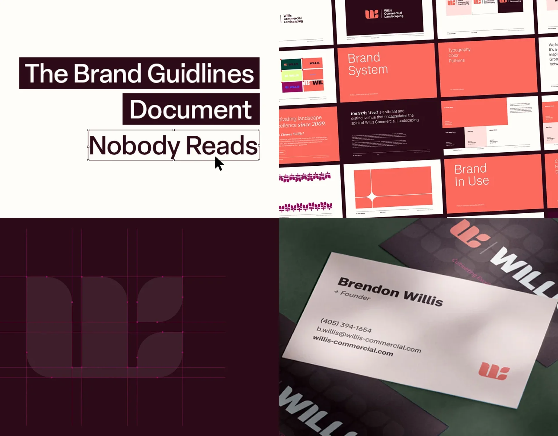
Design Noon is a full-service creative agency working across brand identity, web design and development, animation, video, and marketing for ambitious organizations in the Washington DC area and beyond. You can see how identity and messaging come together in projects like WILLIS, Beachwalk, and UT Services, or browse the full portfolio.
Ready to make your brand sound as good as it looks? Get in touch with Design Noon to talk about your brand.